So, 10 months, 26 months, 30 months, 45 months, 60 months and counting. Looks like a trend. Maybe Molyneux’s right–there will be no recovery this time.
The Scariest Jobs Chart Ever Isn’t Scary Enough : Planet Money : NPR
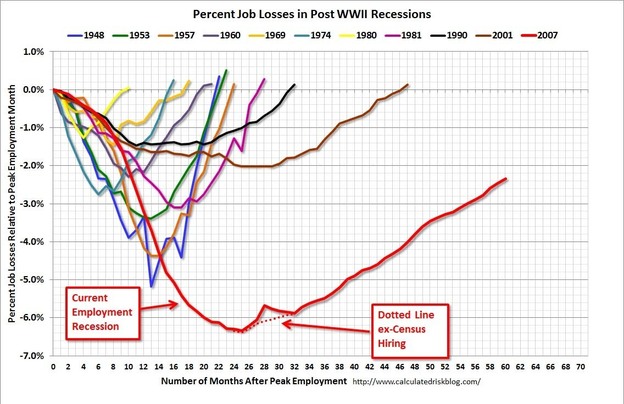
One of the defining graphs of our time (yes, there are defining graphs of our time) comes from the blog Calculated Risk. It tracks the job market in every U.S. recession and recovery since WWII — and it shows just how brutal the the past few years have been.
http://www.youtube.com/watch?v=bYkl3XlEneA